Friday, April 26, 2013

Fae Frog - Deadly

Freakin' Cool is what this challenge is!  Get a Free digital stamp and make anything you want with it, who could ask for more!  Get your buns over to the Smeared and Smudged Forum and sign up!

I am also going to enter this in the Haunted Design House Challenge 165, since the skin melting off my guy shows his bones.  The challenge is Skeletal Remains - anything relating to skeletal remains e.g. skulls, skeletons and bones etc.
While you are clicking around, check out all the great posts there and get ready for a new challenge Monday.

I do no know if any of you have seen a little TV show called Lost Girl, but it is all "FAE".  I kept wanting to do something along those lines, but ended up more along the lines of the TV show, Grimm.  This is an 8" x 8" scrapbook page from Aunt Marie's book...


The Gorey Deets
I printed out the Fae Frog onto shiny card stock, colored and cut out.  I used Crystal Effects on eyes.
I used a Rick St. Dennis DIGI stamp called "Let's have Brains", which I printed out on Very Vanilla card stock.  The bones were gone over with a Versa Mark Pen, then heat embossed with White Embossing Powder.  I then used an Aqua Painter and inks to color in, then cut out.

Poisonous secretion is Crystal Effects and Tangerine Tango re-inker, dried into drip shapes on a silicon mat.

I scrunched up some white tissue paper, then spritzed with Pink Pirouette Smooch Spritz and Mulberry Red Maya Mist to make the brains.

I sponged in the dirt, then used a stamp from a set called Clockworks (Stampin' Up!) to help add the darker sploches to make it look like dirt.

Trees are stamped with Early Espresso ink.  Tree stamp is by (c) Daniel Torrente from Stampotique, called Tree.

I used an Aqua Painter and inks to color in the background.

I adhered cut digi images and wrote in the words with a Sharpie pen.

Thursday, April 25, 2013

HDH 165 - Into The Earth You Shall Go

Haunted Design House Challenge 165 - anything relating to skeletal remains e.g. skulls, skeletons and bones etc.

See what you can dig up by checking out the challenge.  They last 2 weeks, so no reason to join.  

I have finished cutting and mounting my new stamps and wanted to use the skeleton in the lower right on page.  I kept making things that I did not like.  Set aside the image and decided to let my brain stew on it for a little bit.  I woke up this morning and new what I wanted to do.

I love this quote and what not better to store those skeletal remains and soon to be dead other than those fantastic structures called mausoleums.  "...and into the earth you shall go."
Here is my entry:

DETAILS
This is an 8" x 8" scrapbook page.  
I used Google for mausoleum images and found three that I liked.  They are the top two and lower left images.
The saying and the skeleton on the lower right are from Smeared Ink.  I just became a member of their rubber stamp club and got these great stamps last month.
The lower center is a stamp from Lost Coast Stamps called Ancient Man i.  I drew in the skeleton lines on face and neck.  I also used a gold marker for the leaf crown.
On each images I used inks and an Aqua Painter to color in and around images.
There is also Crystal Effects on a single image in each of the 5 images. 
All stamped images where inked with Black Staze On.
Designer paper, card stock, inks, and supplies are from Stampin' Up!

I am also going to use this project for the Architechural GDT Challenge on the Smeaerd and Smudged Forum.

Wednesday, April 24, 2013

My Wailing Tree

Junk Funk Challenge at Smear and Smudged this month is - Foil.  I just recently did a project with foil and wanted to create a 3D project to really show off all those cool textures that you get with foil.


THE DEETS
 
TREE
 I started scrunching the foil to the form that I wanted the tree to be.

Then added more foil at the bottom to make a thick trunk. 

I also kept this part of the tree pretty lose so that when I did add the faces at the bottom it would be easier to press them into the trunk.


I had to use folded squares to first form the face with a stylus, then I used Crystal Effects to help hold the faces in place once they were pressed into the trunk.  There are 9 faces around trunk.

Once the faces were in place and dry, I used a blue Sharpie to color in the eyes and mouth.

I finished twisting and forming the tree, then spritzed with Mulberry Red Maya Mist, and a concoction of acrylic paint (Burnt Umber) and alcohol.  The spirtzing really helped in showing all the grooves and cracks in the tree.

I added Crystal Effects to the faces to help define them a little more.


BANSHEE
My wailing beauty is from Rick St. Dennis, click HERE for link to her.

I printed out and did a mirror image as well because I wanted the project to be able to be seen from all sides.

She was colored in with Copic's, set with Crystal Effects, fussy cut, glued together, and places in the tree.


The last two photos are of two other angles so that you can see all limbs, faces, and her.

As I am writing this, the designer paper in the back really does not fit this.  Sorry!  It needs a good graveyard scene.


Tuesday, April 23, 2013

WARNING - SEXUAL IN NATURE PROJECT - A Dirty Little Ditty


WARNING


IF YOU OFFEND EASILY, the following post IS NOT for you.  
This post is raunchy, rude, crude, offensive, and down right dirty.


DO NOT GO ANY FURTHER.  


CLICK TO A NEW PAGE OR POST NOW.  


YOU HAVE BEEN WARNED...


I think that anything out there is up for grabs when it comes to creativity.  This was the project I was originally going to post for my Dirty Vintage Blog Hop project, but did not finish in time.

There was an altercation with one of the members in the hop's project this past week.  So in support of her, I have finished my initial project and am now posting it in its full glory.  

Support your fellow crafters' in ALL that they do.  I know that I appreciate your hard work, creativity, humor, and above all...the guts to show your creation.


Now, let's get DIRTY with this Dirty Little Ditty...

 I had made a card for this, but changed it up today.

I though how fun would it be to make a little book, a little bag, and little rhyme.

I cut off the legs of some kids jeans and sewed the bottom up.  My husband would not let me cut any of his pants or the little book would have been a big book.


 You can get the book out from  the top, but in the spirit of the moment, I chose to unbutton and zip down.

 I made pockets and you have to pull the tip of the penis to see the rhyme.

I pulled apart ribbon and glued the pieces to 3 1/2" circles for the hair.

All card stock is crumpled, then flattened with the big shot.  It is also sponged and inked with Sahara Sand, River Rock, Pink Pirouette and Early Espresso ink pads.

I stamped the saying with the Designer Typeset Photopolymer stamp set. 

The numbers are from Typeset Alphabet die.  I used the negative to sponge in the numbers with Early Espresso ink.


The tip of each penis has tissue paper to help give dimension and texture.

Inside each pocket there are dimensionals along the top and bottom edges that enable the pull out to happen and stop at the right length.
I made up the rhyme and had a really hard time with 7 & 8, any suggestions?


I also used Crumb Cake Seam Binding Ribbon for the hair, belt on bag, and on front of book.

Linen Thread was also used on front of book to hold tag.  Tag was from a punch.

All products used to make this project are from Stampin' Up!.  Please note that they are not associated with this project or had knowledge of its creation.  I take full responsibility of this project.


Monday, April 22, 2013

Hans & Gret

I started this project just over a week ago.  Then somehow managed to lose it, and the bits and pieces that go with it.  I do not know how I could lose this since my work area is not that big!  All is well, but I did have to re-stamp two of the cages.  At least I finished and on to the next project...wait...now where did I put that???

Smeared and Smudged April's Challenges are so great this month.  Get over there, join the forum, and get craftin'.  The Guest Designer this month is Sharon Sahl.  Please check out her blog post HERE to see what she has created to inspire the rest of us.  Her's is an Architectural Challenge, using any architectural elements in your project.

I loved her dimensional layers and wanted to create something along those lines as well.  I decided on a 5 1/2" x 5 1/2" card.  I have been dying to put some kids in cages (too bad I can't cage mine) which inspired me to create the inside of the witch's house in the tale of Hansel and Gretal.  I hope that this meets the challenge and "Thanks Sharon" to a fun day of creativity.


Details, details, details....
BASE - Back Wall & Floor
Back Wall
The base measures 5 1/2" x 5 1/2" out of Whisper White card stock.  All card stock is from Stampin' Up! (SU!). 
I found the witch and oven images on Google and printed them out on copy paper.  I cut and colored each with markers (SU!) and blender pen.  I used a silver marker to also color in oven and give highlights to the witch to see her clothing better.
Behind the oven I used a Tim Holtz Embossing Folder for the brick and used Early Espresso, Basic Gray, and Always Artichoke ink pad and blender pen to color in and add texture.
The back wall is designer paper from a pack called Tea Party (SU!).  I used an Embossing Folder called Woodgrain (SU!) to add texture.  Then sponged with Early Espresso ink.  I tore into strips and adhered to base, then added the stove.  I sponged around stove to help it look like the brick was worked into the wood wall.

Floor
I stamped the bottom of base with a background stamp called Woodgrain for the floor.  Used the blender pen and Early Espresso ink to make floor boards.

SIDES AND LAYERS
On the sides of the card I attached an accordion strip of card stock to help with the layer effect.

I stamped girl in cage, colored, cut out and attached to first fold on right side of card.

The black strip is suppose to be the bottom of the wall crease into the floor.  I think this is a little to big, but it is glued down and I could not redo.  This strip is also attached to the first fold on right and left side of card.

There is a floor board strip that is attached to the second fold on right and left side of card.  The witch and stool are on this strip.
 
 I finished the top layer with a frame that I used a Cuttlebug Embossing Folder on.  I used White Embossing Powder on skull heads.  Frame is then sponged with Early Espresso ink and layered onto a Basic Black frame.  Frame was then attached to top fold on accordion.

EXTRAS
Cages
Cages were stamped with Versa Mark and heat embossed with Black Embossing Powder.  I then stamped the kids in with Basic Gray ink and colored in with blender pen and markers.  I cut out each, poked a hole, and added Linen Twine (SU!).

Stool
Stool is stamped in Early Espresso ink.  I cut out and added Crystal Effects.

Bones
Bones were stamped with Basic Gray ink.  I then colored with blender pen and Early Espresso ink.  Stamp is from a set called Creepy Creatures Cling from Inkadinkado.

I added dimensionals to help hold up Gretal, witch, empty cage, and stool.
SU! Stamp Sets:  Greeting Card Kids (Hansel and Gretal), Aviary (3 cages), Cherish Friendship (stool & basket)
 

Thursday, April 18, 2013

April Smeared and Smudged Member Blog Hop

APRIL BLOG HOP 
I have joined this months Smeared and Smudged member blog hop, Dirty Vintage  The rules are to use vintage style images, make it dirty by grunging it up, distressing it, or making it just plain DIRTY!.  I am excited to see what everyone else has created and will be hopping around myself. 
Blog Hop links are below, and should be up by 9:00am, so go get dirty today.

My husband and I will be celebrating 10 years of marriage next year.  Hubby is not quite as gruesome, or as old, as Vlad in my 12" x 12" scrapbook page.  But, I hope that he has that intense and insane look 50 years from now!

I do have to make a quick apology to Mr. Rick St. Dennis in that I had to free hand re-draw his wonderful lines, after adding the texture to face and hands.  So that is why Vlad looks a bit off and not quite like the original.


Here are the bloggers that are in April's Blog Hop:
SHELL
 BLACK DRAGON
KAPREE
MADELEINE BOUQUET
SUSAN
HAZEL 
KAY
MONIQUE
WENDY
ANNA
FIONA

THE DEETS:
12" x 12" Page
The two designer papers I used are Stampin' Up!.  The base is from a pack called Sent With Love and the floral is from Tea For Two.
I used a large background stamp for flowers on the bottom of page called Pleasant Poppies.  The key image is from the stamp set Established Elegance.  Spot mark stamp from the set of French Foliage.  Saying on floral designer from the stamp set Blooming With Kindness.  All stamp sets are Stampin' Up! and are current.
I spritzed base with Riding Hood Red re-inker (SU!) mixed with water, Maya Mist called Mulberry Red Mist, and randomly sponged with Soft Suede ink (SU!).
I drew in the journal lines with Stampin' Dazzle Gold Marker.
The 10's are die cut (SU!), crinkled and sponged on Vellum card stock (SU!).
Used Smooch Vanilla Spritz over entire page to finish.


Vlad
I printed off a digital stamp from Rick St. Dennis, Vlad, onto an 8 1/2" x 11" sheet of card stock.
For the facial and hand skin, I mixed Gesso and Stampin' Up! re-inkers to get my color.  Then added a texture from MuddPuddles.net called Marine, to make skin look warty.  I lucked out when I went to put Crystal Effects over texture that it turned the lovely color that it did.  I then used markers to shade and outline.

Eyes and mouth are highlighted with Crystal Effects.

I shaded the shirt, but wanted to give it a more "old" look.  I traced arms with black Sharpie onto Vellum card stock, then cut out and used Crystal Effects to glue to arms on printout.  Liked the look and did the same with ruffled front of shirt.

Vest and pants are colored in with inks, blender pen, and Aqua Painter (all SU!).  I used the Gold Marker for the pendent, clasps, and stitching.

Stems & Flowers
Stems are Basic Grey card stock spritzed with Old Olive re-inker and Vanilla Smooch Spritz mixture.

Flowers are punched from XL Fancy Flower punch (SU!) and newspaper.  I then spritzed the punched flowers with Riding Hood Red re-inker (SU!) mixed with water, Maya Mist called Mulberry Red Mist, and Pink Pirouette Smooch.

Monday, April 15, 2013

I Don't Like People.

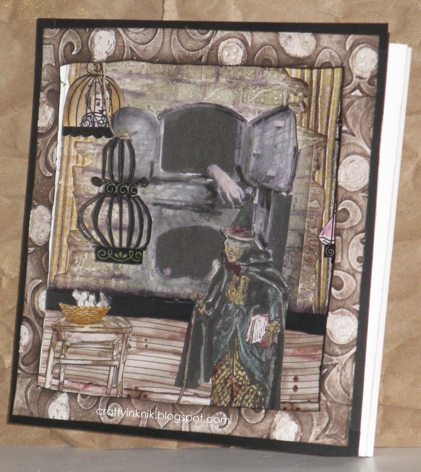
Another April challenge from the Smeared and Smudged Forum has been the inspiration for this 3D project.  The challenge, Oh! The Horror!,  was our take on a poster of the movie Sinister.  I have not seen this movie, but am putting it on the list of Too See's.

I have searched everywhere for the original tutorial for this project and I can not find it.  I do not even know what it is called!
The best name I can come up with is Roll Out Triangle Tunnel Card.  The original, I believe, had a word spelled out in each of the windows.  Again, please forgive me original creator and if I ever find you again I will be sure to edit this post and give credit where credit is due.

I made my project from memory and was happy that it all fit together.  As John "Hannibal" Smith would say, "I love it when a plan comes together."


DETAILS
All card stock, inks, and accessories used are Stampin' Up! products.  I will note other products that are non-Stampin' Up!.

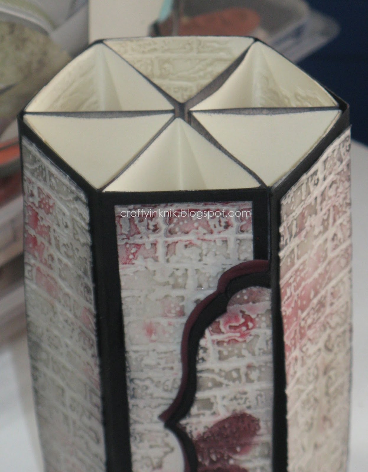
So, the embossing folder I used for all the brick background work is a Tim Holtz Alterations.

I used Sahara Sand ink pad directly to raised embossed side.  Sponged Basic Gray ink around the edges.  Then I used my fingers and Real Red ink for random highlights of red on brick on out side of project.  Last I squeezed a bit of Crystal Effects on each outside panel and spread here and there.

The flap to open and close is from the Labels Framelits collection.  I did put a magnet under flap and first wall to help keep the project closed.  I used my fingers and Bravo Burgundy ink to make the finger prints on the label.  The prints were then Crystal Effect-ed.  

I thought about making a lid, but liked how you could look into the open top.  So, no lid.

I used 6 triangles cut and scored from Very Vanilla card stock and the Labels Framelits collection to make each of the triangles for the inside of project.  Each of the triangle was then sticky stripped to a scored rectangle of Basic Black card stock.

For each triangle, I stamped the front with a large background stamp called Netting with Basic Gray ink.  Then sponged around all edges with same ink.  I used my fingers and Bravo Burgundy ink to make the finger prints on triangle sides.

The center area, of each triangle, where the framelit was used to make a window was sponged with Bravo Burgundy ink and then Basic Gray over it.  I then went around window with an Aqua Painter. 

When you look into the windows, you see the brick background which was only sponged with Sahara Sand ink.

On the first triangle inside the window, I used a stamp from Lost Coast Designs called Dolls Border.  I stamped with Staze On Black ink onto Very Vanilla card stock.  I then cut her out, and hard to see but used some color to help define skin, eyes, and clothes.  She was then Crystal Effect-ed (CE-ed).
The words were also stamped with Staze On Black ink and saying from Dylusions stamp set called Say It How It Is.  I cut up the saying, smeared Bravo Burgundy ink over it and CE-ed.  Each cut saying and doll is popped up with a dimensional.

My March Rubber Exclusive Stamp Set - Prints, from Smeared Ink, just arrived and had to to use one of the small hand smears in the second window.  I stamped in Bravo Burgundy ink, used Aqua Painter to continue smear and add drip effect.   

For the next four window insides, I used the Aqua Painter and Bravo Burgundy ink for the first layer of "blood" dripping down the wall.  Once dried I re-dripped, this time using Real Red ink.  I went back once more and added Cherry Cobbler ink with Aqua Painter to keep that blood color.

On the last triangle, I stamped the skeleton with Versa Mark ink onto Very Vanilla card stock.  I then heat embossed with Clear Embossing Powder.  This stamp is from October's Smeared Ink Stamp Set - As Death.  I cut out and adhered him to back panel before adding the layers of red.

When I was finished I went over drips on all triangles with Crystal Effects.  Then spritzed the entire inside with Vanilla Shimmer Smooch Spritz.

I am excited to make another one of these, so keep a look out.  I hope this makes you want to get that stamp in your hand and create!


Monday, April 8, 2013

He Watches

Haunted Design House had started a new challenge, HDH164, Bare Bones.  This is a great one because you must be clean and simple.  That is pretty hard for some us, no embellishments or layers.  Please go check out some of the projects that are posted, they are a help in getting you in that frame of mind.

 DETAILS

I cut out a skull head shape from cardboard.  Then the eyes and nose.

I placed my Whisper White card on some paper and set the cut skull in the center of card front.

I made a mixture of Early Espresso re-inker, Champagne Mist Shimmer Paint, and alcohol.  Spritzed the card front until front was completely covered. 
The cut cardboard skull was then removed and I stamped my saying with Summer Starfruit ink then Black Staze On.

Stamp is from Smeared Ink set As Death.
All other supplies are Stampin' Up!

Your Advice,

Woo Hoo, new month, new challenges!  Get over to the Smeared and Smudged forum to play along.
Eeeek, Spring Break is this week here and I am going to lose some creative time.  I hope to get to some challenges that I have my eye on so there my be a lot of posts today.

The Rock N Rolla Challenge for April is Nirvana's song Heart Shaped Box.  There were a lot of ideas that went through my head.  The images that stuck with me were the muscles and tendons, poppies and butterflies, and the little girl in white.  Then of course the lyrics had to be in there somewhere also.

I am really happy with my 12" x 12" page.  Hope it has some inspiration in there for you.
Have a great week and go create!


THE DEETS
First, all products used to make this page are from Stampin' Up!

CHEST
I really wanted to use the image of the muscles and tendons of the upper body.  But how to make???  Stampin' Up! has Filter Paper pieces that I decided to use.  I cut it into strips and ran it though the Big Shot in the Embossing Folder Woodgrain.  Then used the Pink Pirouette ink pad directly onto filter paper.  Highlighted the embossed ridges with Riding Hood Red ink.

I hand drew the body first onto Very Vanilla.  Then used the Aqua Painter and Calypso Coral ink to help with the definition of the muscles.

I tore up the filter paper into strips and adhered them to my base with Snail, tape runner.

Once all the strips were down, I used the Riding Hood Red Marker to help define the muscles once more.  Trimmed and adhere to my 12" x 12" Designer Paper.

HEART
I made this mosaic heart stamp with left over pieces of rubber.
It was Versa Marked then stamped onto Whisper White card stock.
I used Iridescent Ice and Basic Black Embossing Powder with heat gun.
I applied ink directly from pads to embossed heart 
(Tempting Turquoise and Bravo Burgundy)

HAT
The filter paper comes in 12" x 6" strips and 6" circles.
I folded sides of one circle and adhered to a triangle from Whisper White card stock.
I used the large background stamp Pleasant Poppies which were embossed with Basic Black Embossing Powder.  I colored in flowers with Riding Hood Red Marker.

Edges of page were sponged and stamped with Basic Black ink and mosaic heart stamp.